Chess takes the crown
Opportunity
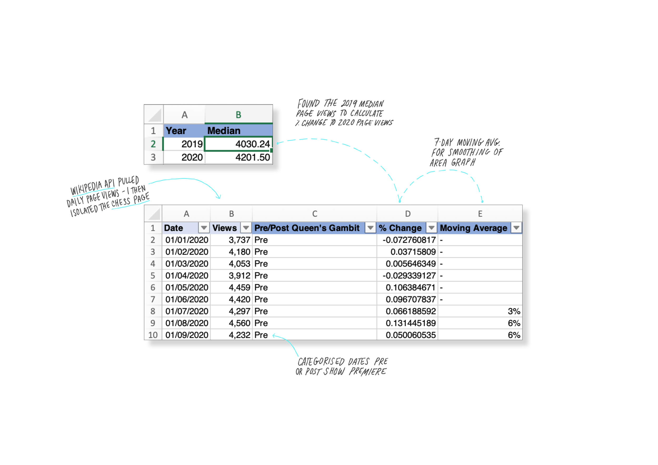
Like everyone else in November 2020, I binged The Queen’s Gambit. But just like I didn’t bake Bread, I didn’t play chess. Instead, as I do with most pop culture phenomena, I looked into the data. This project was simply born out of an obsession with The Queen’s Gambit aesthetic, area graphs and moving averages, while still having access to Wikipedia API from our statistics workshop.
Approach
While Chess seems dull, old and boring, The Queen’s Gambit gave an old game a surprising sense of chic. So just like data about chess seems boring, I wanted to borrow from the show’s playbook. I had just done a fundamental design workshop, which helped my confidence to push my design skills and make something more aesthetically led. Admittedly, I wasn’t the first to report on everyone’s new found chess-obsession, but I wanted to put a few things to practice, it was timely, and I felt I had a unique approach to offer.
Tools
Excel
Adobe Illustrator
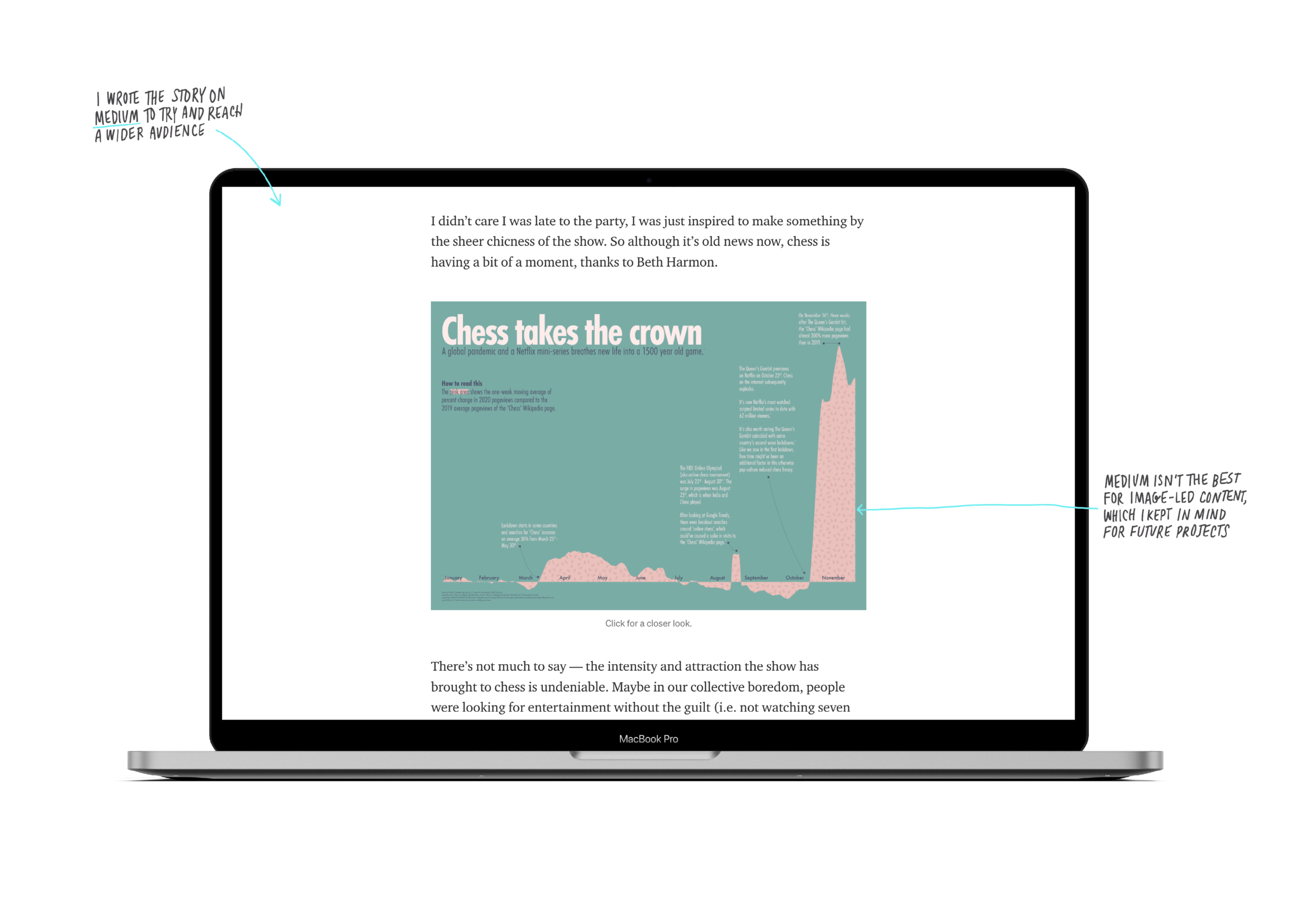
Life after death on Wikipedia by The Pudding (2020) stoked my obsession with smoothed area graphs, percent changes, and moving averages. This approach inspired my Bread article, this visualisation, and also future projects. I find the percent change or growth as a visualisation easy to digest, while also being visually appealing.
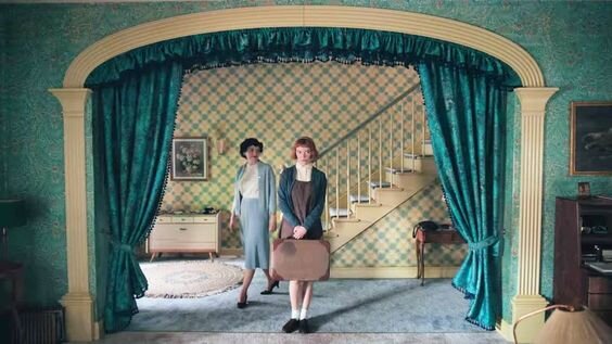
Already knowing the chart type I was going to use, the main inspiration for this project was the aesthetic the show created, which I absolutely loved. It was a 50s colour and pattern explosion. I wanted to use a bold pattern – like the wallpaper in the house. In the end I had to do a very simple pattern due to readability.


